Complete rebrand of the UK’s largest importer of martial arts clothing and equipment
Bytomic Martial Arts Equipment
On this occasion I was asked to create a complete new brand story from scratch. This involved not just the background thinking for the positioning, proposition and strategy, but the words and images to express it. The story then had to be told in the form of a website, press ads, sales literature, direct mail, packaging and an exhibition stand.
The company was Bytomic, the UK’s largest importer and supplier of martial arts clothing and equipment. I was invited to meet the couple who ran it by their web designer. Over a coffee it quickly became apparent that they needed a lot more than a website overhaul. Although a big and successful business it suffered from the lack of a coherent and distinctive brand identity. This meant it was easy for competitors to copy whatever the company did. The managing director explained it like this: “We introduce a new product line and before you know it an instructor with a school in Wolverhampton has called his cousin in Karachi. The cousin has a brother-in-law with a factory in Hyderabad. Within weeks the guy in Wolverhampton has a garage full of cheap and nasty version of our original and a full page ad in Martial Arts Illustrated that looks pretty similar to ours.”
A market in mayhem
The more he talked the more I realised this whole market was a confusing and frenetic free for all. For starters there were so many different martial arts – Judo, Kick Boxing, Tae Kwon Do, Karate, Mixed Martial Arts, Kung Fu, Boxing, Jiu Jitsu and Muay Thai to name but a few. Then within each discipline there was a massive range of variants, each with its own rules, schools and federations – the British Tae Kwon Do Council alone had fourteen different member organisations within it. In terms of buyers there’s a huge variety – federations, schools, clubs, sports centres, gyms, instructors and the individual students themselves. To complicate matters further Bytomic also sold to high street shops and online retailers. So it was quite a challenge to come up with a single simple story that would appeal to all these very different types of customer.
Getting the brief sorted
I needed help, not just with the graphics but in formulating the positioning, the proposition and the strategy – so I teamed up with my mates Bev and Dave at DB Communication by Design. Having done the necessary background research, and following a number of meetings, we agreed a brief with the client. This was to create a completely new brand story and look. One that clearly differentiated them from all the competitors and positioned them as a company that could be trusted to deliver excellent choice, quality, value and service. What’s more, it had to be done in a highly stylish and distinctive manner – so competitors would find it hard to copy. To put it in the simplest possible terms they wanted to go from being a glorified online market stall to the martial arts equivalent of John Lewis.
Food for thought
Bev and Dave got busy on the look, developing graphics and visual styling that drew heavily on the far eastern roots of martial arts. They also started to experiment with logos and icons that were heavily influenced by oriental calligraphy and design.
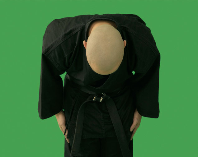
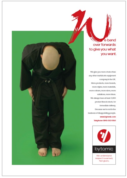
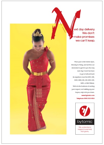
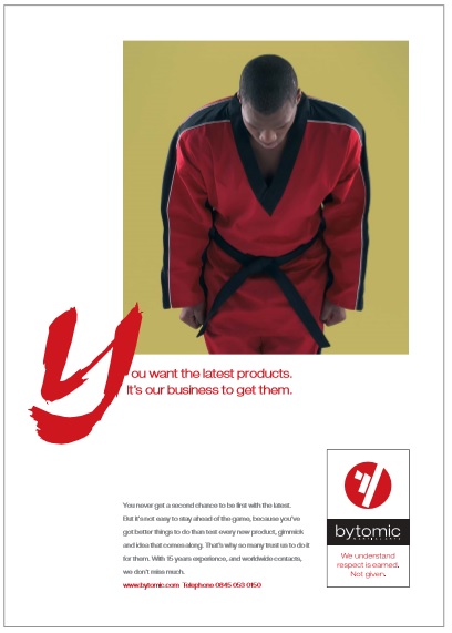
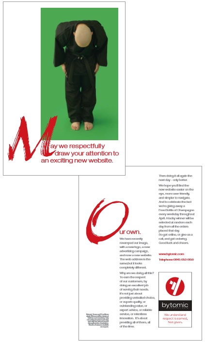
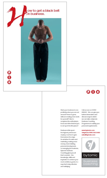
We also explored the ethos behind martial arts, the fact that they are all based on the values of integrity, discipline and respect. This led us to the strapline “We understand respect is earned. Not given.” and a new logo.
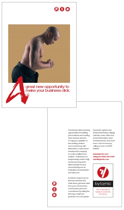
From here we moved on to an exploration of how best to express respect in a distinctive visual way – and came up with the image of a person bowing. This image became central to the whole story, as expressed though a series of press ads that ran in the main martial arts magazines over a period of months (NB, the images didn’t come from a library – we commissioned and art directed a photographer so we got exactly the pictures we wanted).

Making the idea work online
Having established the brand story and found a powerful way to express it we then applied it to the website.
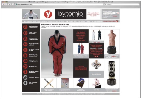
The design was clean and simple while the use of the oriental-style icons, as well as the bowing images, gave it a distinctive look and feel that was uniquely Bytomic.
We then created a direct mail piece that was sent to all past and present customers, as well as other potential trade clients, to inform them about the new brand and website.
Taking the idea out on the road
Bytomic then asked us to design and produce an exhibition stand they could take to trade shows, industry events and martial arts competitions.
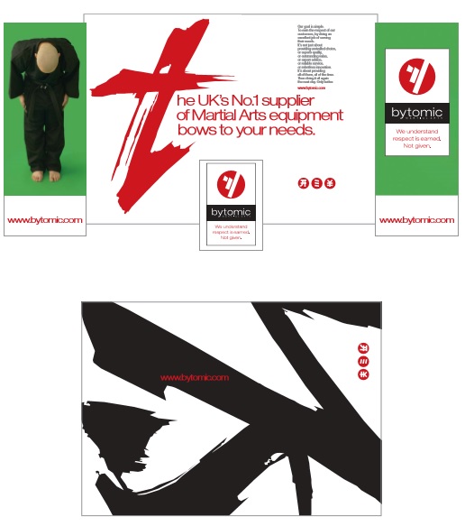
We also designed and produced flyers inviting customers and potential trade buyers to visit the Bytomic stand at these events.
We even redesigned the packaging
The strong graphics that Bev and Dave had developed also worked brilliantly on the packaging for Bytomic’s own brand product ranges.

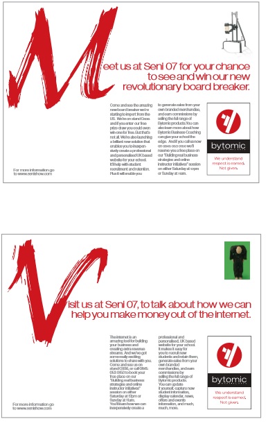
Bytomic business coaching
The managing director of Bytomic was keen to offer business coaching to others in the industry – owners of martial arts schools, clubs and gyms, as well as equipment and clothing retailers. This not only created another income stream but increased customer loyalty.
Bev and Dave designed another version of the logo.
We also wrote and designed mailers that were sent to potential clients.
As well as one to promote a course on how to promote you martial arts business online.
Postscript
The couple who ran the company were keen to sort the branding before selling up and retiring. They successfully accomplished this some years ago. Since then, however, the new owners have shown little appreciation of what they acquired in the way of the brand story and image. It has now reverted to being a glorified market stall!