Simple ideas have more impact.
Welsh Back Health Club
When I worked in Bristol ad agency Bedrock during the 90s I was a member of a city centre squash club that also had quite a large gym. They wanted to publicise these facilities to a wider audience and attract members from beyond the rather narrow squash playing fraternity.
The club’s odd name came from the stretch of quayside where it was located – the area where boats from Wales traditionally docked was known as “Welsh Back” (and about 100 yards where Daniel Defoe met Alexander Selkirk, the unfortunate seafarer whose story became the inspiration for the novel “Robinson Crusoe”). I came up with the idea of reversing the word “back” to add a twist to the already weird title.
They wanted to run a series of ads on bus backs. Having very little budget these had to be very simple – basically just a headline, strapline and logo. For starters I came up with the idea of reversing the word “back” to add a quirky twist to the logo.
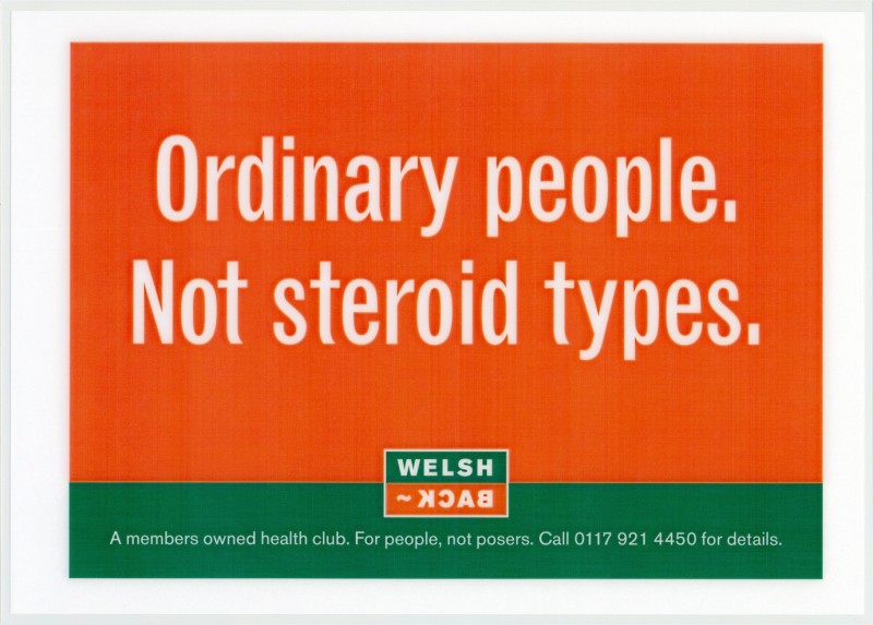
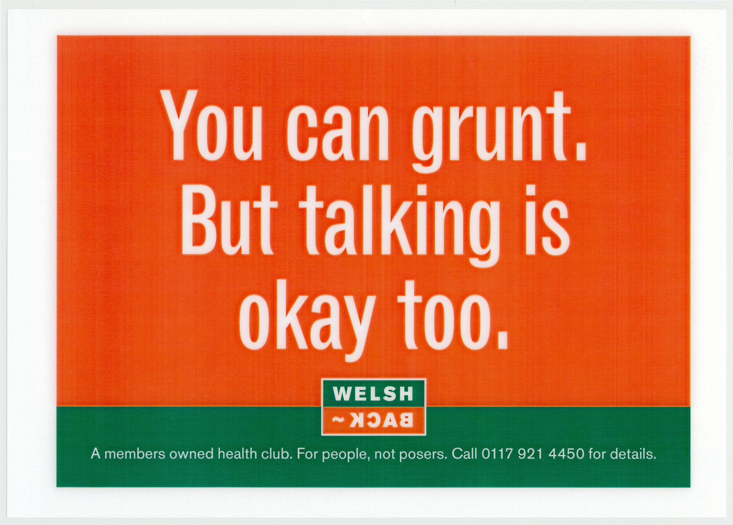
Then I had a think about the target audience. Looking around the gym I saw people who went there to get fit, unwind on the lunch hour and just work off some steam. They weren’t there to impress others, but to feel good in themselves. And the atmosphere was friendly, not up itself. This insight led me to the strapline “For people, not posers”. From here the headlines just flowed:


Did they work?
Let’s just say that the club had these posters on the walls for 20 years and used the strapline all that time – so they were obviously felt I’d captured the essential ethos of the place.
They’re different (they don’t take the lazy option of just sticking in an image of a smiling girl in a leotard or a ripped guy pumping iron). They’re engaging (they let the target audience know we’re on their wavelength). And they’ve got enough attitude to get noticed, raise a smile and be remembered.